6-minute read
The 19th century was, for Europe and the United States in particular, a time of exploration and scientific study. Large parts of the world were still little explored and poorly mapped. Concurrent with the production of improved maps and atlases, there was a craze for a unique kind of infographic that has long since fallen by the wayside: the comparative tableau, showing the world’s highest mountains and longest rivers. This lush coffee table book sifts through the David Rumsey Historical Map Collection, one of the most renowned collections of its kind, to give readers a glimpse into the development and history of these unique images.

An Atlas of Geographical Wonders: From Mountaintops to Riverbeds, written by Gilles Palsky, Jean-Marc Besse, Philippe Grand, and Jean-Christophe Bailly, published by Princeton Architectural Press in September 2019 (hardback, 208 pages)
The first thing that will strike you is the size of the book, a landscape-format book measuring some 31 by 28 cm with a tactile, ribbed cover. Flipping through it quickly convinces you that this format is needed to do justice to the images.
The second thing to note is that this is a book with a bit of a backstory. It was originally published in French in 2014 by Fage Éditions as Le Monde sur une Feuille and for this Princeton Architectural Press edition has been translated into English. Philippe Grand is the publisher at Fage Éditions and is the editor of the book, while Jean-Christophe Bailly and the duo of geography and cartography historians Jean-Marc Besse and Gilles Palsky each provide a short introductory chapter.
Those are followed by a short chapter on what might very well be the progenitor of the comparative tableau, an 1805 image from the hand of Prussian geographer, naturalist, and explorer Alexander von Humboldt. He was a prolific polymath who achieved many things in his life. One of his achievements was the climbing of Chimborazo, a mountain peak in Ecuador that at the time was believed to be the highest in the world. It inspired him to draw a tableau that was published in his Essay on the Geography of Plants, showing plant distribution along the mountain slope and mentioning the height of other mountain peaks.

With these introductions out of the way, the bulk of the book consists of several themed galleries. Initially, cartographers designed and drew mountain tableaux. But rather than aiming for geographic realism, they bundled the world’s highest mountain peaks together into imaginary collages, allowing easy comparison. These could vary from the schematic (such as the 1820 image by Carl Ferdinand Weiland below) to the pastoral (see the next 1814 image by J.-S. Devèze de Chabriol).


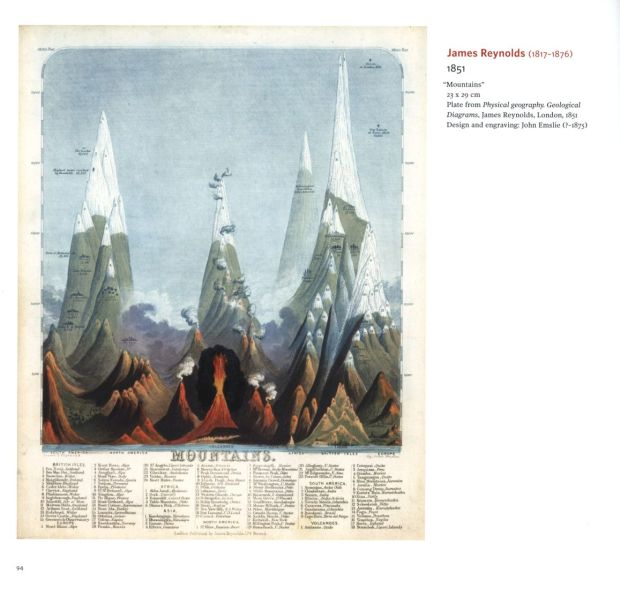
Two things stand out in particular. One is the sheer diversity with which this task of making a comparative tableau can be achieved. Take for example below detail from an 1827 tableau by Philippe Vandermaelen where the mountains on different continents are shown in segments bounded by a box. A personal favourite is the second 1851 tableau below from James Reynolds, which shows mountains as exaggerated narrow spires.

 The second notable thing is that each approach spawned many imitators. Maybe it was the image reproduction techniques of the time, but many tableaux were redrawn by several artists with so little variation that they looked like carbon copies of each other. Looking at them through today’s eyes it is hard not to think of the word “plagiarism”.
Together with an interest in mountain peaks, geographers and explorers were mapping river systems and trying to find their headwaters, naturally leading to comparisons of river lengths. The book includes a number of tableaux where rivers were rendered straightened out to allow comparison (although a striking exception was the 1834 image below produced by the Society for the Diffusion of Useful Knowledge in London).

I guess it was only a matter of time before certain clever clogs figured out that drawing the mountains ascending from left to right created an empty triangular space that could be filled with rivers of decreasing length from left to right. And thus was born the combined comparative tableaux showing both river lengths and mountain peaks (see below 1826 example by Bulla and Fontana). Here too, variations on the theme existed, as shown in the second 1885 image by William Hughes.


The comparative craze in the end even extended to waterfalls, and sizes of lakes and islands, leading to some very busy infographics, such as below 1851 image by John Tallis and R. Montgomery Martin. And not infrequently these images were combined with increasingly accurate world maps, such as the second 1854 image by Traugott Bromme.


Ultimately though, by the turn of the 19th century, this type of image declined. As mentioned in my review of Why North is Up, warfare and military interests drove the development of technology, requiring both more accurate maps, but also providing new kinds of information to show on maps. It was the refinement of layer colours, or hypsometric tints, by John Bartholomew that was an important contributor to the decline of these tableaux. As noted in Palsky & Besse’s introductory essay, though, there has been a renaissance of these kinds of images, for example when comparing heights of modern skyscrapers. And the original images have lost none of their staying power (see for example the book cover of Darwin’s Evolving Identity, published in 2018).
An Atlas of Geographical Wonders is a feast for the eyes, using its layout to good effect to show off the wonderfully reproduced images. Where images are so large and detailed that they could not be reproduced in any legible form, they are often reduced, though for some notable examples double-page spreads show close-up details. Other, smaller images are shown at full size or shown only slightly reduced, allowing you to read labels. All of them come with captions with basic information on artists, year, source, size, and (often) details on the type of image. For many, one or two paragraphs add more information, highlighting notable developments as explorers refined their knowledge of our world, or adding other interesting tidbits of information.
Cartophiles can rejoice, as this book is a visual delight that will make a wonderful addition to their collections. But the phenomenal production values make this a very enticing book for anyone with an interest in historical maps and images.
Disclosure: The publisher provided a review copy of this book. The opinion expressed here is my own, however.

Other recommended books mentioned in this review:


__________________________________________________________________


